6. Check the model
Before you trust a suggestion, check how well the model predicts results it has not seen and whether its uncertainty is honest. This page opens the diagnostic plots and says what each shows and how ALchemist computes the numbers.

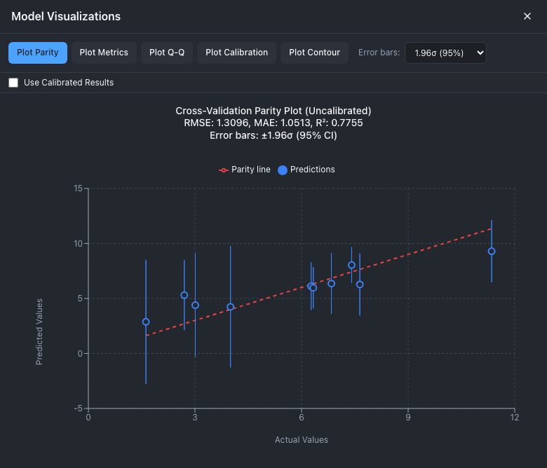
The parity plot of the first BoTorch model, trained on the ten simulated design points. Each point is one result, predicted with that result held out.
1. Open the plots
- Train a model; see Train a model.
- In the Model tab, choose Show Visualizations. The centre column becomes Model Visualizations, opened on the parity plot.
- Choose a plot: Plot Parity, Plot Metrics, Plot Q-Q, Plot Calibration or Plot Contour.
- Close the panel with the × at its top right.
Open plots redraw when the model retrains, for example after Add Point... with the retrain box ticked. The panel closes when you choose Clear, New Session or Join; choose Show Visualizations again in the new session.
What each plot shows
Plot Parity, Plot Q-Q and Plot Calibration use the same set of cross-validated predictions: the data are split into five folds, and each fold is predicted by a model fitted without it. So every result has one prediction, and one uncertainty, from a model that did not see it.
| Plot | Shows | Controls |
|---|---|---|
| Plot Parity | Each result's cross-validated prediction against its measured value, with a dashed line where they are equal. The title gives RMSE, MAE and R². | Error bars: none, or ±1.0σ, 1.96σ (the default), 2.0σ, 2.58σ or 3.0σ. Use Calibrated Results. |
| Plot Metrics | One metric against the number of results: the cross-validation is repeated on the first 5 rows, the first 6, and so on up to all of them. | A menu of RMSE, MAE, MAPE and R². The plot takes a few seconds, because it repeats the cross-validation for every size. |
| Plot Q-Q | The standardized residuals, sorted, against the quantiles of a standard normal distribution, with a dashed diagonal. The title gives Mean(z), Std(z) and N. A line below it says when the model looks well calibrated, biased, over-confident or under-confident. | Use Calibrated Results. |
| Plot Calibration | For nominal coverages from 10 % to 95 % in steps of 5 %, the fraction of results that fall inside the matching interval, against the diagonal of perfect calibration. A table beside it gives each level's difference and a status: Good, Acceptable, Under-conf or Over-conf. | Use Calibrated Results. |
| Plot Contour | The model's predicted response over two variables, with the others fixed. | The two axis menus, a slider or menu per fixed variable (a real variable starts at the middle of its range; see below), Show Experimental Points, Show Next Point, a colormap, Scale and the grid resolution. It needs two real variables. |
A fixed real variable also has a number box below its slider. Type a value and press Enter (or click away) to set it; values outside the variable's range are clamped to it, and Escape puts back the last value. The arrow keys step the box, or the slider once it has focus, by 1/100 of the range, and the plot updates when you stop pressing.
Scale sets the colour bar. Fixed, the default, spans the observed results, from the smallest to the largest, and stays put while you move the fixed values, so a colour means the same value on every slice. Predictions outside that range take the end colour; hovering still shows their value. Per slice stretches the colour bar over each slice's own predictions: more detail within one slice, but two slices can no longer be compared by colour. The app remembers the choice in this browser. When the results have no spread, as with a single result, only Per slice is available. A multi-objective session takes the range from its first objective.
A standardized residual is the prediction error divided by the predicted uncertainty, \(z = (y - \hat\mu)/\hat\sigma\). If the model is right, the \(z\) values look like draws from a standard normal distribution: Mean(z) near 0 and Std(z) near 1. Use Calibrated Results scales every uncertainty by the factor that makes Std(z) exactly 1 on these data, so the calibrated Q-Q plot passes that test by construction. The factor changes the uncertainties shown, not the suggestions.
How to read each plot, and what to try when one looks wrong, is in Reading the diagnostics.
The metrics
Trained Model Info and the parity title show RMSE, MAE and R². Plot Metrics also offers MAPE. With \(e_i = y_i - \hat\mu_i\), the error of the cross-validated prediction for result \(i\) of \(n\):
| Metric | Computed as | Read it as |
|---|---|---|
| RMSE | \(\sqrt{\tfrac{1}{n}\sum e_i^2}\) | The typical error, in the units of the response, weighted toward large errors. Compare it with your measurement noise. |
| MAE | \(\tfrac{1}{n}\sum \lvert e_i \rvert\) | The average error. Never larger than RMSE. |
| R² | \(1 - \sum e_i^2 / \sum (y_i - \bar y)^2\) | The share of the spread of the results the model explains. It can be negative with few results. |
| MAPE | \(\tfrac{100}{n}\sum \lvert e_i \rvert / (\lvert y_i \rvert + 10^{-9})\) | The average error as a percentage of the result. Meaningless when results are near zero. |
RMSE, MAE and R² come from sklearn.metrics. The folds are shuffled with a fixed seed. A model trained on fewer than five results has no cross-validation and no metrics. For a given size, Plot Metrics pools the BoTorch folds into one value but averages the scikit-learn folds' values, so its last point need not equal the numbers in Trained Model Info.
Known issue
The diagnostics have open statistical issues, all explained on Reading the diagnostics. T1: BoTorch cross-validation reuses the hyperparameters fitted to all the data, so the metrics are optimistic. T2: scikit-learn cross-validation uses kernels that were never fitted. T3: Plot Metrics on BoTorch fits BoTorch's default kernel, not yours, when there are no categorical variables. T4: the uncertainty leaves out the measurement noise, so noisy data read as over-confident. T5: the Q-Q plot's theoretical quantiles and shaded band are approximate.
Known issue
W25: a multi-objective model shows no cross-validation metrics in the web app, and Trained Model Info shows none. Over REST the parity, Q-Q and calibration routes take a target query parameter naming the objective; in Python, session.plot_parity(target_columns="all") plots every objective; see Multi-objective.
From Python or REST
import matplotlib
matplotlib.use("Agg")
import matplotlib.pyplot as plt
import numpy as np
from alchemist_core import OptimizationSession

rng = np.random.default_rng(5)
session = OptimizationSession()
session.add_variable("temperature", "real", bounds=(200.0, 300.0), unit="°C")
session.add_variable("pressure", "real", bounds=(20.0, 80.0), unit="bar")
for p in session.generate_initial_design("lhs", n_points=12, random_seed=5):
    t = (p["temperature"] - 260) / 50
    q = (p["pressure"] - 55) / 30
    session.add_experiment(p, output=10 - 6 * t**2 - 3 * q**2 + rng.normal(0, 0.2))
session.train_model(backend="botorch")

fig, axes = plt.subplots(1, 2, figsize=(11, 4.5))
session.plot_parity(ax=axes[0])
session.plot_contour("temperature", "pressure", ax=axes[1])
fig.tight_layout()
fig.savefig("check.png", dpi=120)
session.plot_qq().savefig("qq.png")
session.plot_calibration().savefig("calibration.png")
session.plot_metrics(metric="rmse").savefig("metrics.png")
The cross-validated predictions behind the plots are on the model, so you can compute any statistic yourself:
Each plot reads one route. The parity, Q-Q and calibration routes take ?use_calibrated=true, and the metrics route ?cv_splits=5.
The response holds y_true, y_pred, y_std and metrics (rmse, mae, r2, mape). GET .../visualizations/metrics, GET .../visualizations/qq-plot and GET .../visualizations/calibration-curve return the other plots' data, and POST .../visualizations/contour the contour grid.
How ALchemist does it
Every train caches one set of cross-validated predictions on the model (_cache_cross_validation_results: 5 folds, shuffled, seed 42), and the parity, Q-Q and calibration plots and the metrics all read it. Plot Metrics calls the model's evaluate, which repeats the cross-validation on growing subsets in data order. The calibration factor is Std(z) of the cached residuals. The full description, with the formulas and the references, is in Reading the diagnostics.